Error Feed Trends: Score Trends and Activity Heatmap
How to use the Trends tab (Events Over Time, Score Trends, and the Activity Heatmap) to understand how an issue is evolving.
About
The Trends tab shows the temporal story. Is this getting worse? Did it spike after a deployment? What time of day does it concentrate? Are scores improving or degrading?
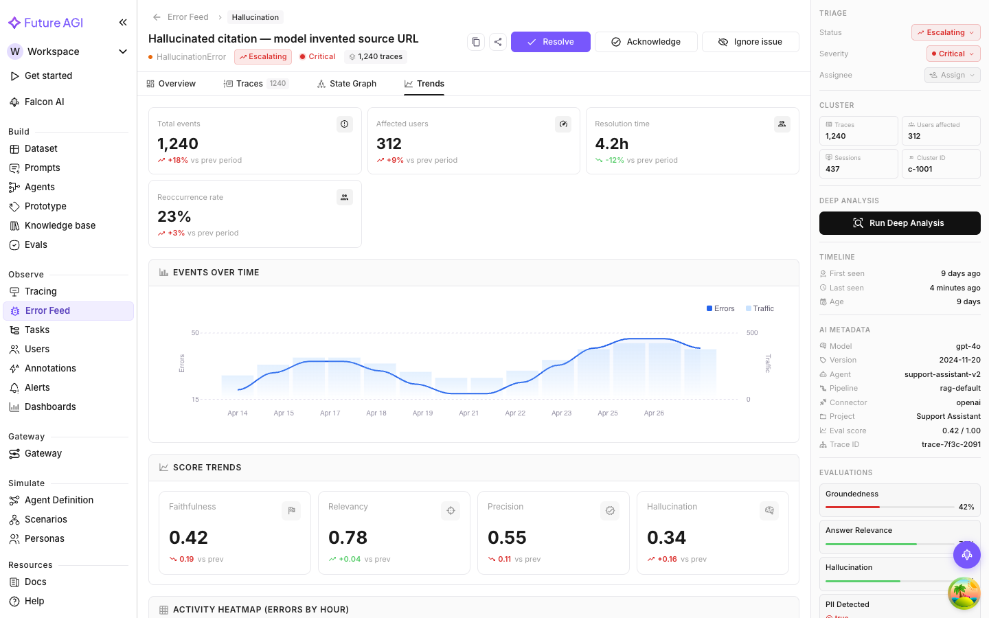
Events Over Time
How often errors in this cluster have occurred over the selected time range. Two series:
- Errors (area/line): error occurrences per day in this cluster
- Traffic (bars): total trace volume Error Feed analyzed in the same period
Showing traffic alongside errors is deliberate. A higher error count might just mean more traffic; the actual error rate could be stable. When the bars (traffic) and the line (errors) rise together proportionally, the rate is holding steady. When errors outpace traffic growth, the problem is genuinely getting worse.
Reading spikes
A sudden spike on a specific day is worth correlating with your deployment history. If you shipped a new model, updated a prompt, or changed tool configurations that day, the spike likely traces back to that change.
A gradual upward slope (rather than a spike) means the error is tied to changing input distribution: the kinds of queries your users send are shifting in a direction that triggers this failure mode more often.
Score Trends
How the four quality dimension scores (Factual Grounding, Privacy & Safety, Instruction Adherence, Optimal Plan Execution) have moved over time for traces in this cluster.
Each dimension is a line chart. Declining line, quality is degrading. Rising line, improving. Flat means consistent, which could be consistently good or consistently bad depending on the absolute level.
Most useful for tracking whether a deployed fix actually improved quality. After resolving an issue and deploying a change, watch Score Trends over the next few days to confirm the affected dimension is moving up.
Activity Heatmap
A grid of error frequency by hour of day and day of week. Each cell is a specific hour on a specific day; darker cells mean higher error counts.

What the heatmap tells you
Patterns in the heatmap reveal whether the error is tied to usage. Common ones:
- Weekday mornings, low on weekends: correlates with business-hours usage, likely triggered by specific user behavior rather than a random code bug
- Uniform distribution: the error happens randomly across hours and days, so it’s input-independent and truly systematic
- Specific hours: a concentration at certain hours might correlate with a scheduled job, a batch process, or peak usage from a specific timezone
These patterns help you tell whether the problem is urgent (consistent, all-hours) or a usage-pattern correlation that might resolve once the triggering input changes.
Combining the three views
The most useful read is all three together. A typical investigation:
- Events Over Time: is the issue growing or shrinking? If growing, look at the rate relative to traffic.
- Score Trends: are any quality dimensions trending down? If Factual Grounding has been declining for a week, something upstream changed.
- Heatmap: is there a temporal pattern? Errors concentrating at 9am UTC every weekday is a clue about what triggers them.
This combination often turns a confusing cluster into a clear, attributable pattern.
Next Steps
Questions & Discussion